01 · Overview
Every card promises rewards. Every card has an app to track them.Yet the offers still slip through?
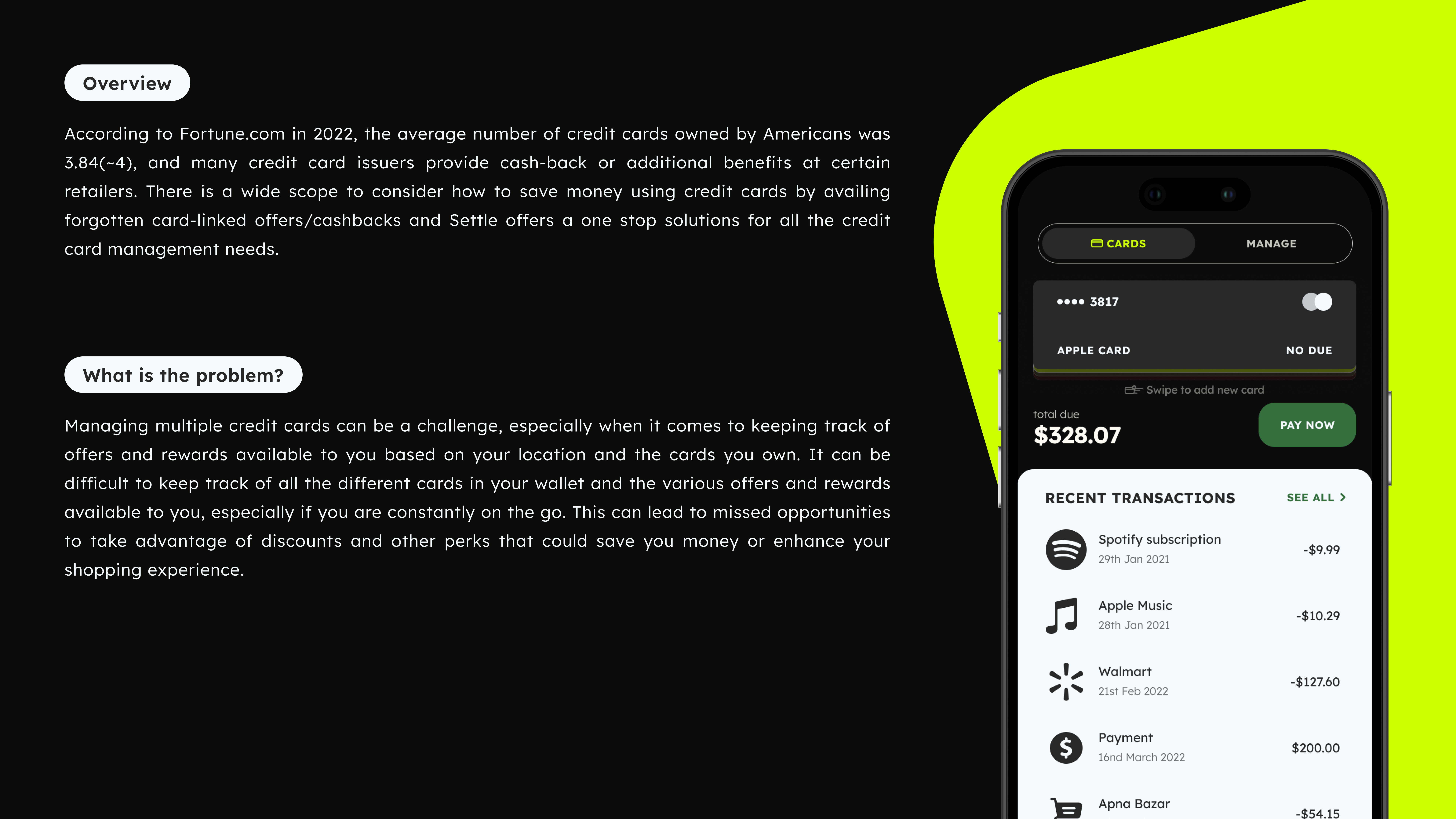
Settle Rewards is a concept app that brings every credit card into one place to manage cards, pay bills on time, and catch the cashback users already qualify for.
The people I designed for aren't careless. They hold multiple cards on purpose, pay on time, and know their cards carry offers. But each card lives in its own app, and the offers change constantly. So the reward is earned but rarely claimed.
The gap sits at one specific moment: checkout. The best card is already in the wallet the experience just never surfaces it before the user pays. Settle Rewards is built to close that gap, using each card's available credit and the user's location to suggest the right card at the right time.
02 · The Problem
Having one app per bank, Still disrupts the experience and complicates the reward system
In 2022, the average American hols about 3.8-4.6 credit cards (Fortune) each person. Each card has its own app, its own login, its own offers. This leads to confusion and missed opportunities due to the complexity.
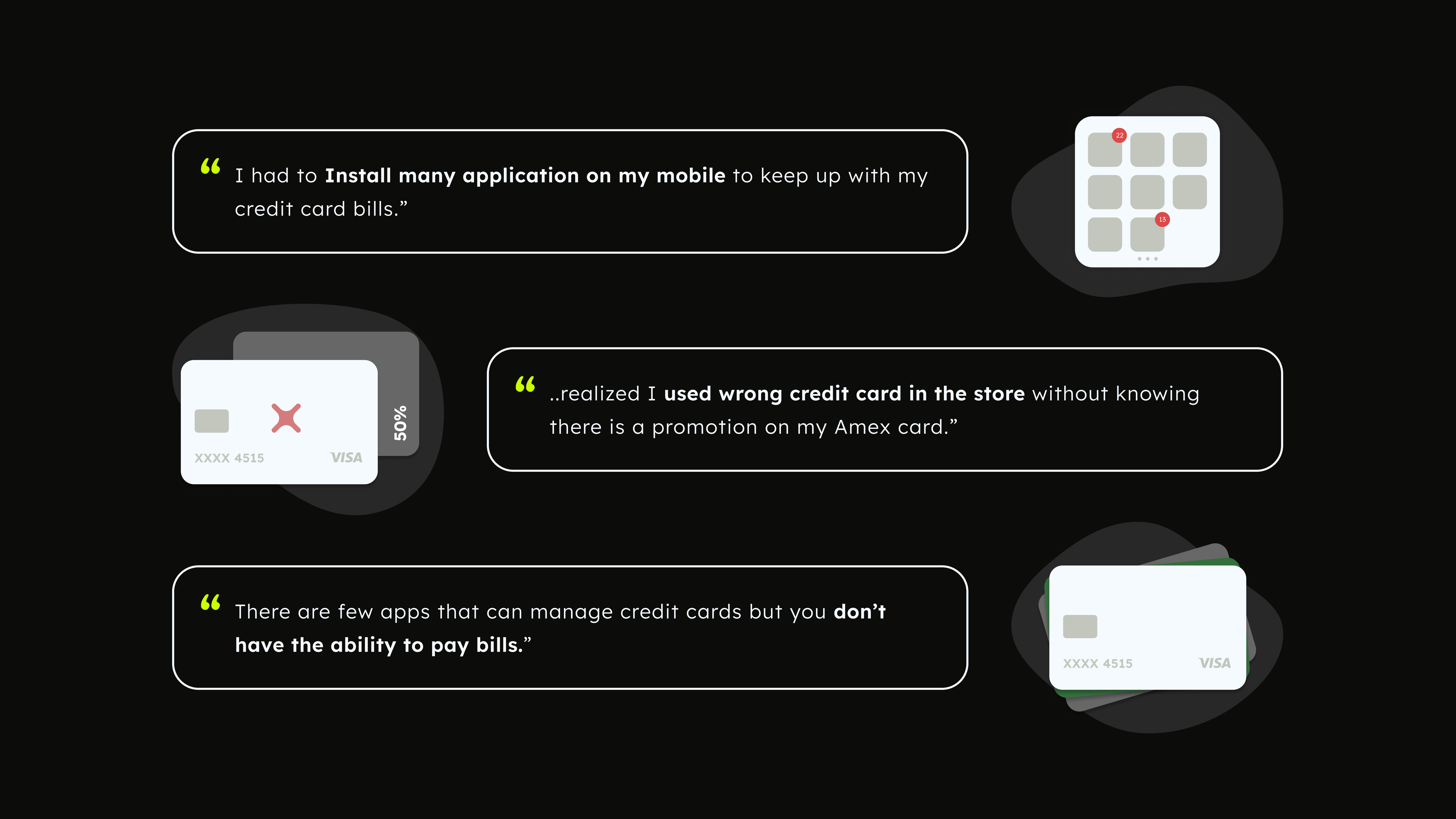
While Interviewing users, we had one moment came up again and again that user's are paying at the register while shopping at the counter, but then they realizing they used the wrong card and missed a piece of discount. Same thing happens after the checkout of online shopping.
People with multiple credit cards miss their promotions, rewards, and cashback they qualify for because managing several cards across different apps and platforms is fragmented, making it easy to lose track.
03 · The Role
Led the design process as PM, overseeing the entire scope through business development.
I aim to be precise in describing this because it clarifies the rationale behind the decisions. As a Product Designer and a PM, I managed the initial problem framing, scope limitations, competitor analysis, and market context, while prioritization was shared and explored. I brought the research signal as the PM we brought scope discipline.
04 · How It Worked
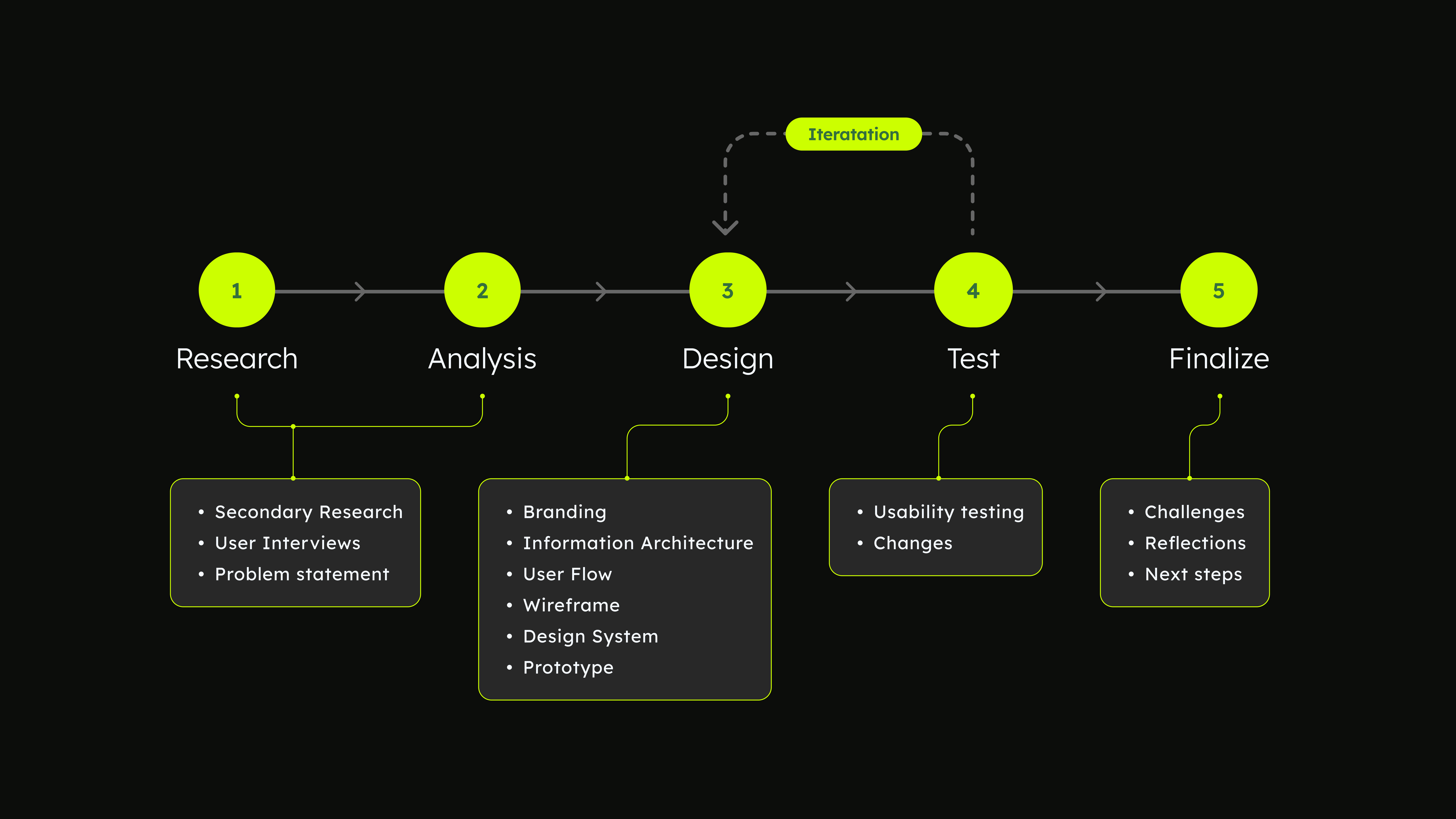
Adopted the double-diamond framework, concentrating on essential phases for strategic decision making.
Research → Analysis → Design → Test → Finalize, with a loop between Design, and Test. The rest of this case study walks each phase as its own piece of craft.
04 · Secondary Research
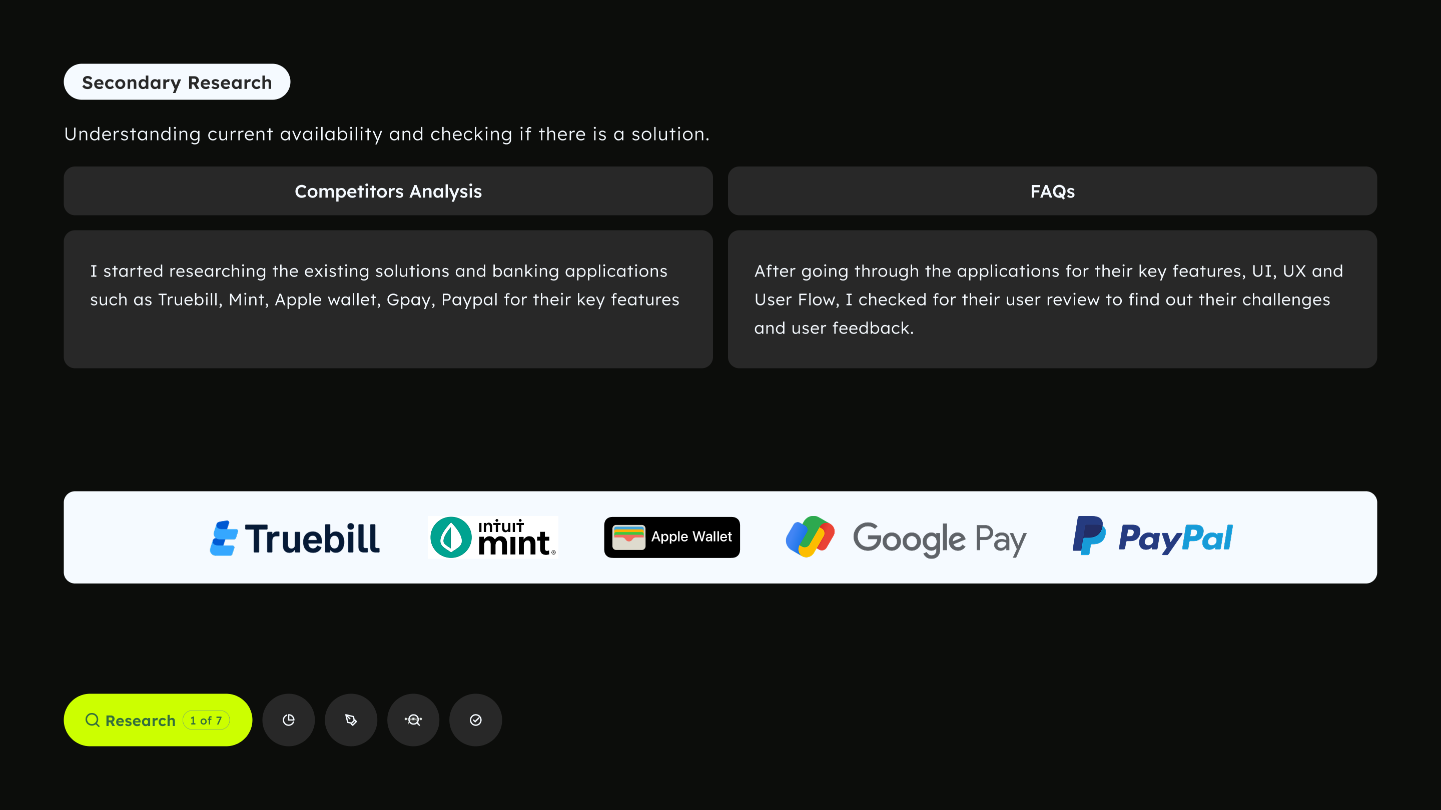
Existing tools excel individually but fail to integrate location data and offer optimal checkout options.
Studied the tools people already use: Truebill, Mint, Apple Wallet, Google Pay, PayPal. Each does one thing aggregate cards, track spend, pay a bill, or show offers. Useful, but siloed.
The gap: no app connected the user's location and each card's available credit to name which card to tap right now. That gap became the reason to build.
05 · User Interviews
Conducted 8 interviews who use's credit cards, revealing challenges in managing them.
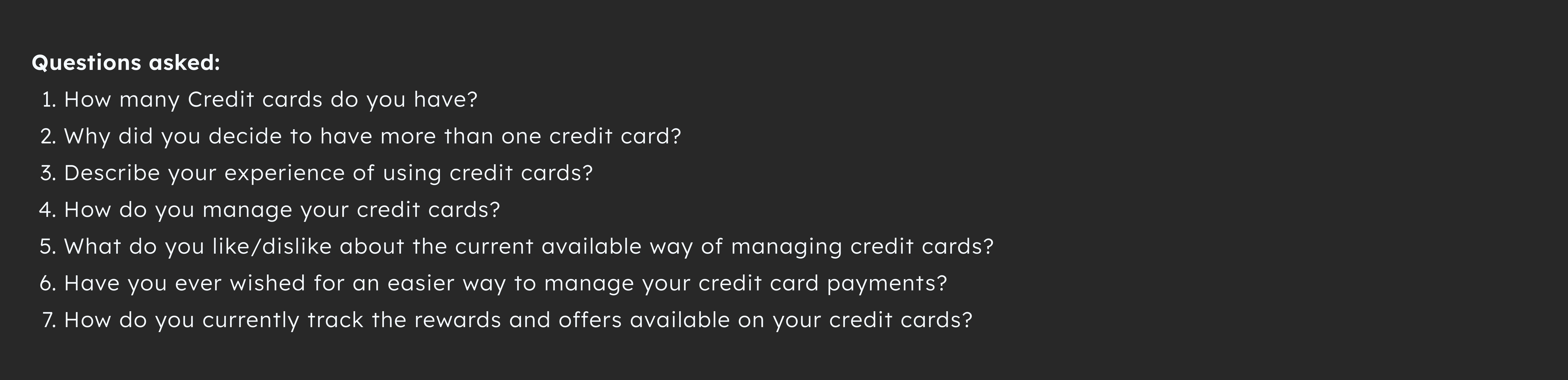
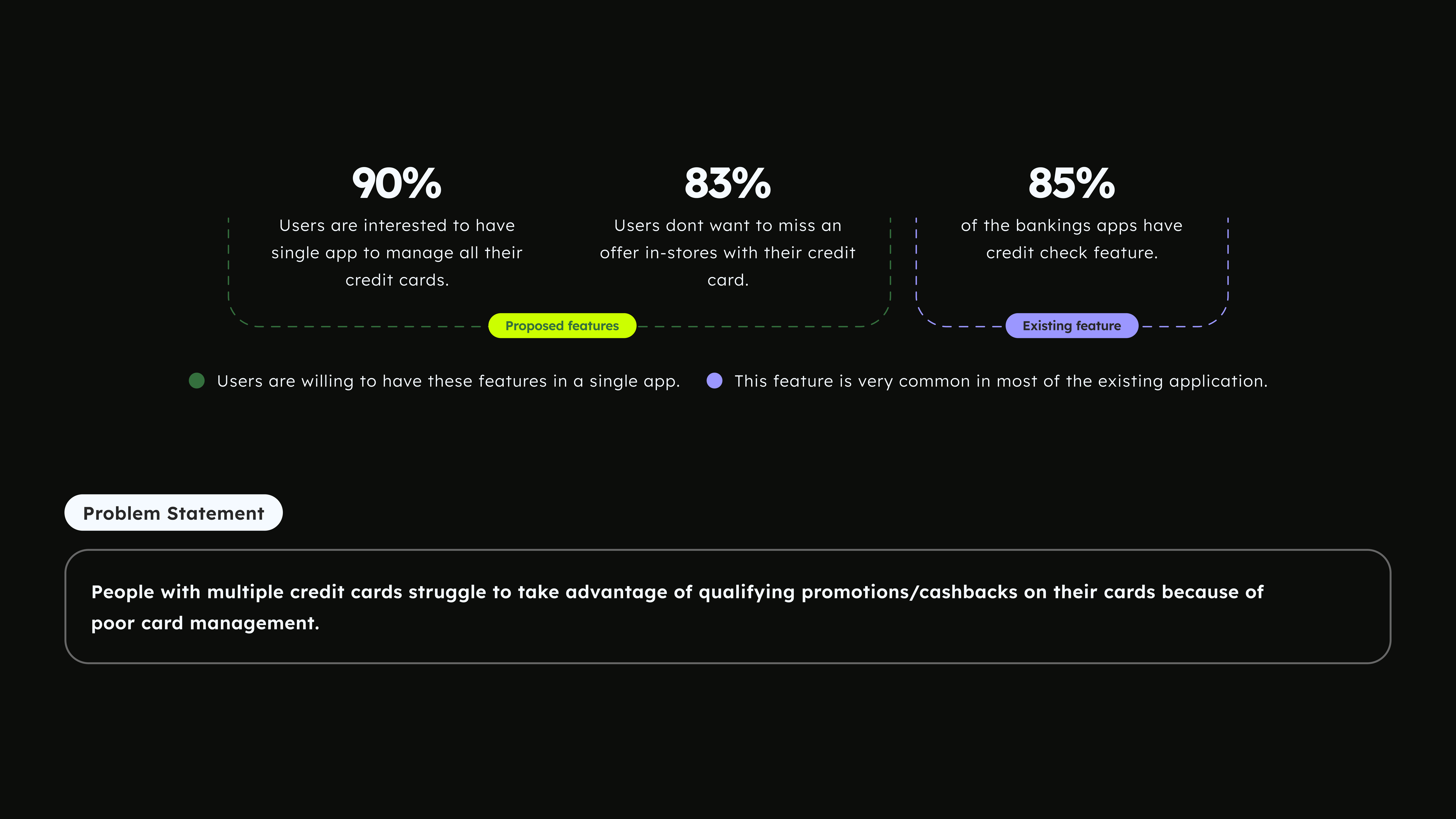
Presenting them as hard percentages was the weakest part of the story. What's true and useful: almost everyone wanted one app, and missing in-store offers was the complaint people felt most. That's enough to design against.
Key challenges included: managing multiple apps and logins, difficulty in choosing the optimal card for purchases, and missing out on offers due to excessive notifications.
06 · How Might We
From pain points to design questions
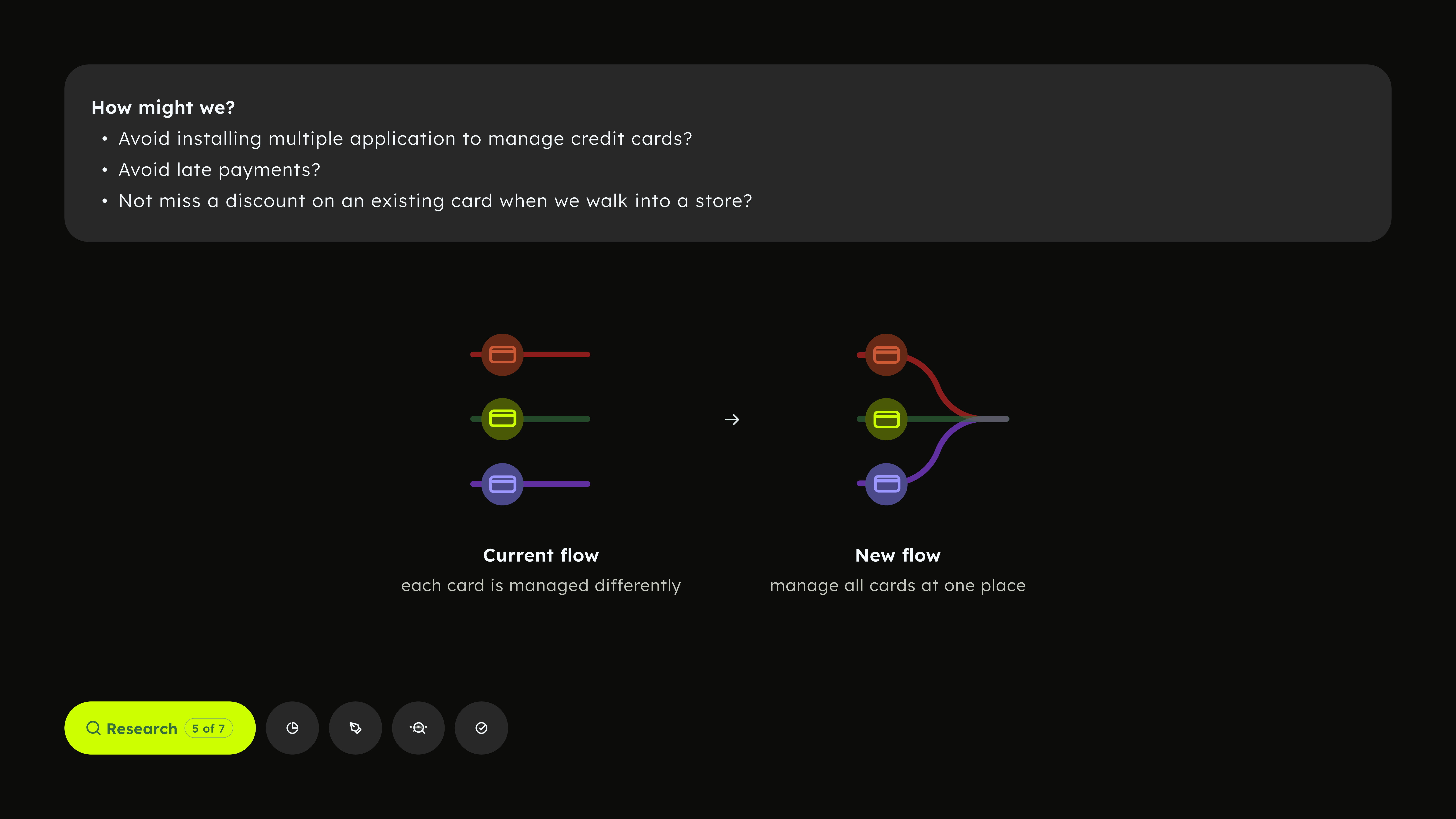
Interview pain points were reframed into three 'how might we' questions to address key issues. Consolidation could solve app overload and late payments, but missing discounts at stores was unique, forming the product's core focus.
So the direction became clear. The move was to bring every card into one place. Nothing about the user's actual wallet needed to change only the experience around it. Collapsing that fragmentation into a single managed flow is what made everything else possible, because once all the cards sit together, the app can finally see across them and surface the right one at the right moment.
07 · Problem Statement
How the research narrowed to one problem
All the frustration from the interviews pointed in the same direction enough to land on one clear problem.
Two needs stood out: people wanted one app for all their cards, and they were tired of missing in-store offers on cards they already owned. A third pattern, credit-check, showed up too but most banking apps already had it, so it was table stakes, not a differentiator.
That split made the direction obvious. The real unmet need was consolidation and missed offers, not the features everyone already had. Since the signals came from a small study, they're read as directional, not hard numbers.
08 · Persona
The target audience for our solution
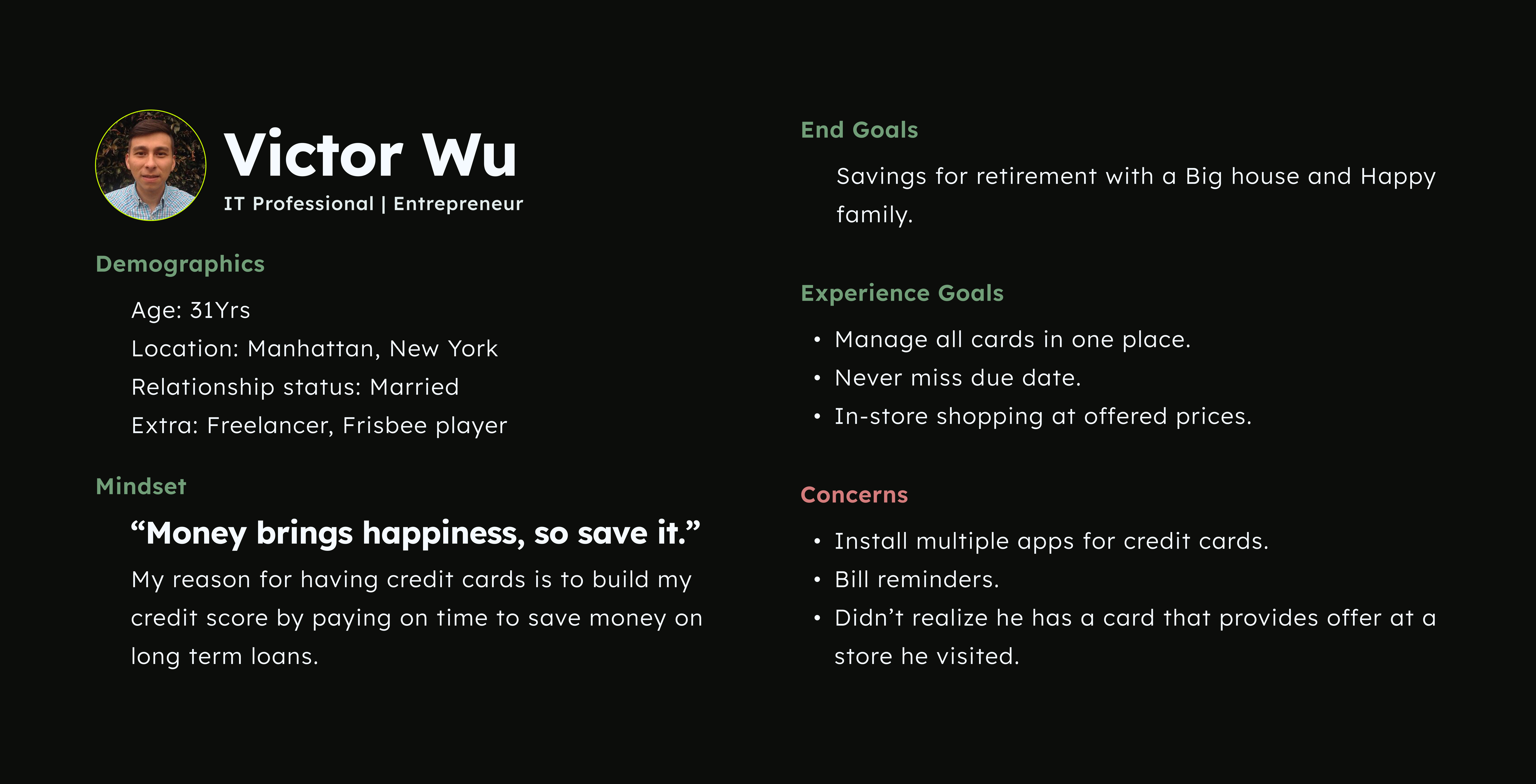
Getting the user right was harder than expected, so before building anything we slowed down to understand one real person in detail. Before developing any solution, we paused to understand the person in detail. This persona represented our initial effort to get to know the user.
09 · User Journey
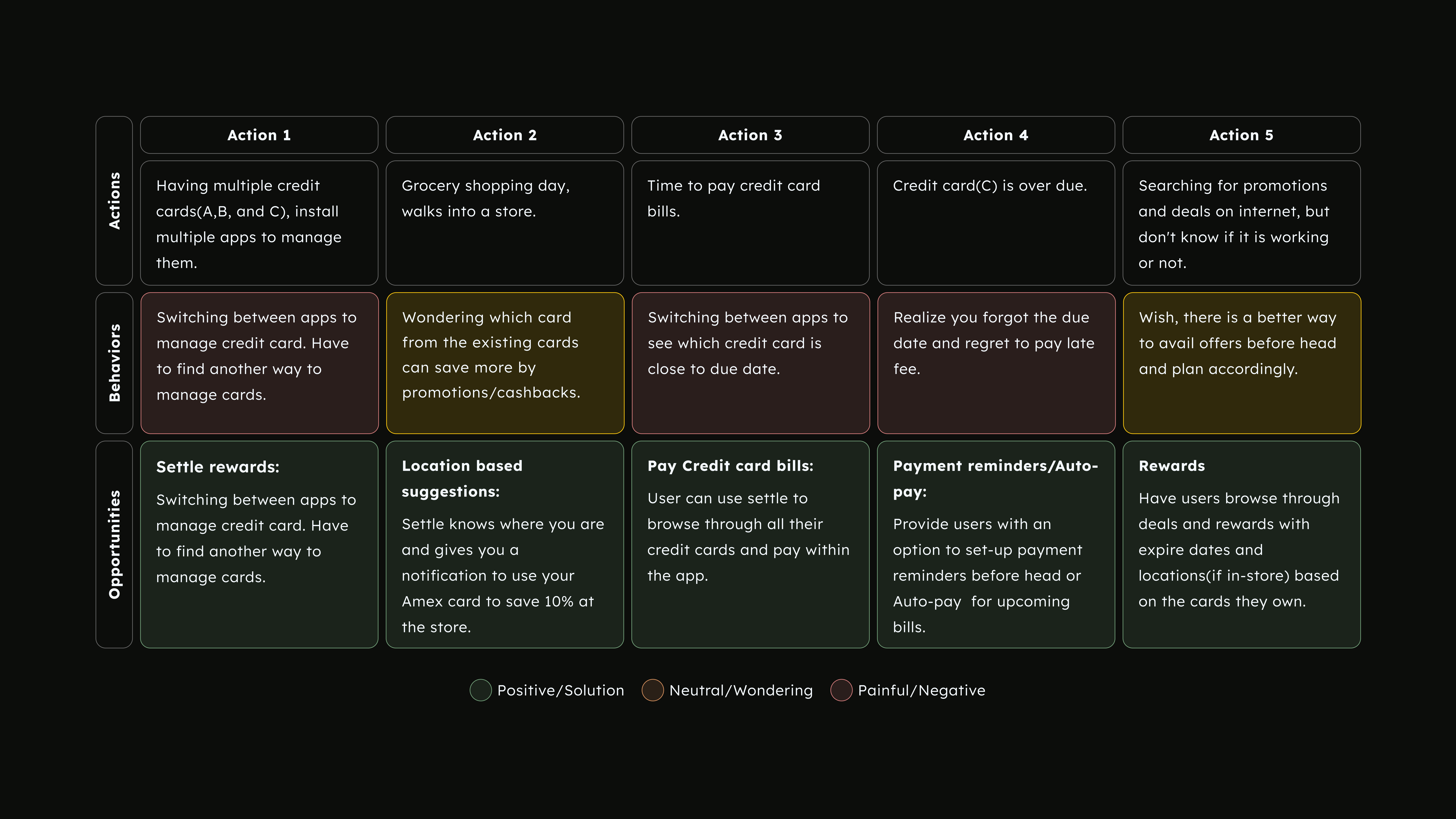
Reading the journey to determine where the product should act
The map tracks the user across five common actions—what they do, how they feel, and opportunities—using color coding to reveal findings. Nearly the entire behavior row is in wondering or negative, showing pain spans the whole routine, justifying one app over a single fix.
Understaing this represnt the logic: card choice becomes location-based suggestions, app switching becomes in-app bill pay, and missed due dates become reminders and auto pay. Each feature arises from a prior low point, emerging from the journey rather than being predesigned.
10 · Technology Integration
How Settle enables data to function effectively
The whole product rests on one assumption, that Settle can see every card in one place. This section was where we worked out how that would actually happen, because a single app is only useful if the data behind it is real.
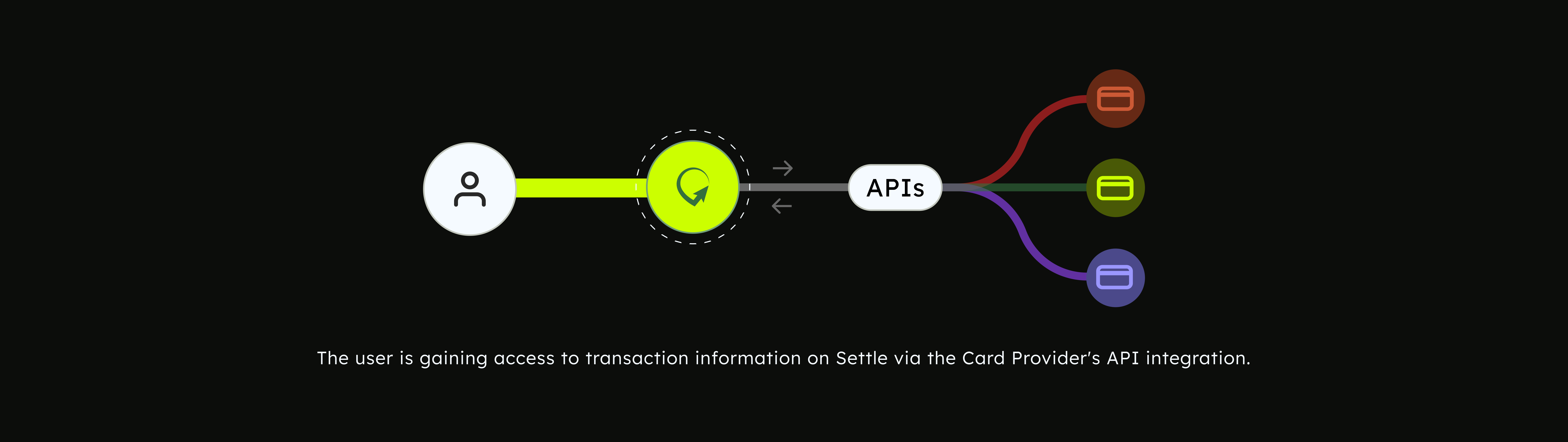
· Product Integration based on transactions
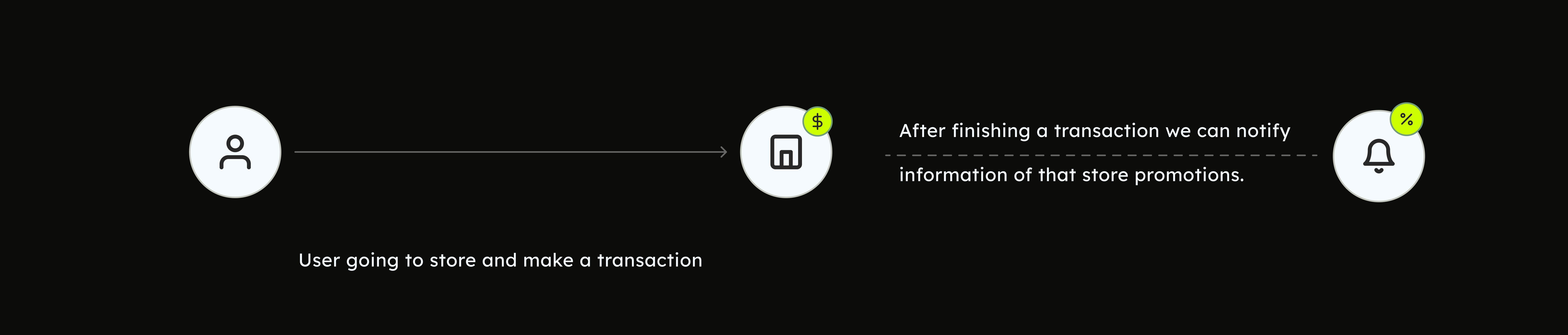
Integrating daily deals based on user transaction patterns
An app that sends future promotions based on a user's transaction from a location would be a convenient tool for users looking to save money on their purchases. Here's how it might work:
App collects and analyze user data to gain insights into their transaction history at a specific location. By understanding their purchasing patterns and preferences, the app is able to tailor and send personalized promotions and discounts for future purchases at that same location, enhancing the user’s shopping experience and encouraging repeat visits.
For eg. if the user frequently buys coffee at a particular coffee shop, the app might send them a promotion for a discounted coffee or a free pastry with their next purchase.
· Technology in place
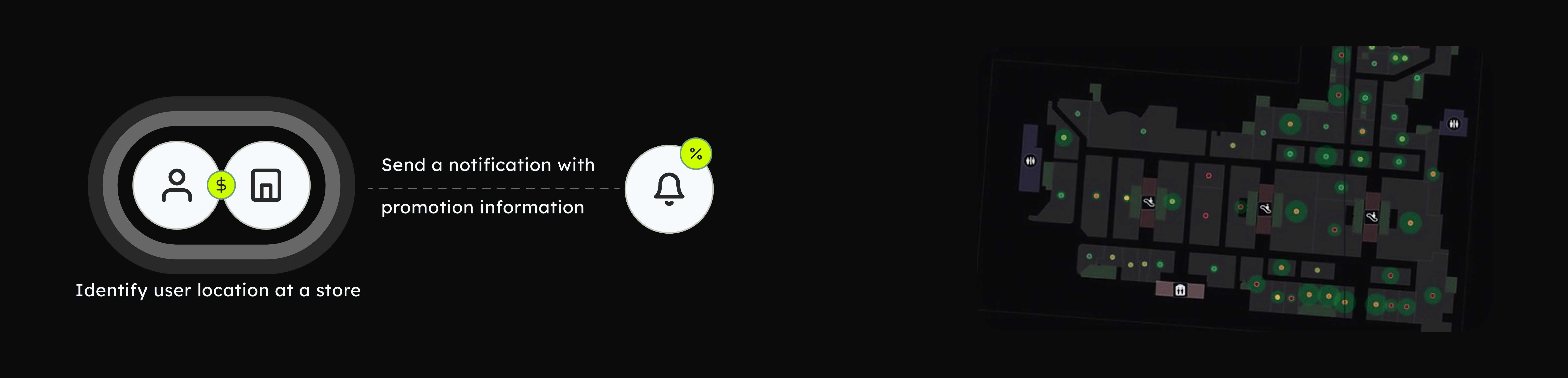
Indoor location technology
Indoor location technology uses a variety of methods to determine the location of a user inside a building or other enclosed structure. This can include methods such as WIFI triangulation, Bluetooth beacon technology, and even the use of cameras and computer vision algorithms to identify unique features in the environment.
Once the user's location has been determined, the technology can then be used to identify the specific store or area within the building that the user is in. This information can be used to provide location-based suggestions to the user, such as recommending a particular credit card to use based on the store's affiliations or promotions.
11 · SWOT Analysis
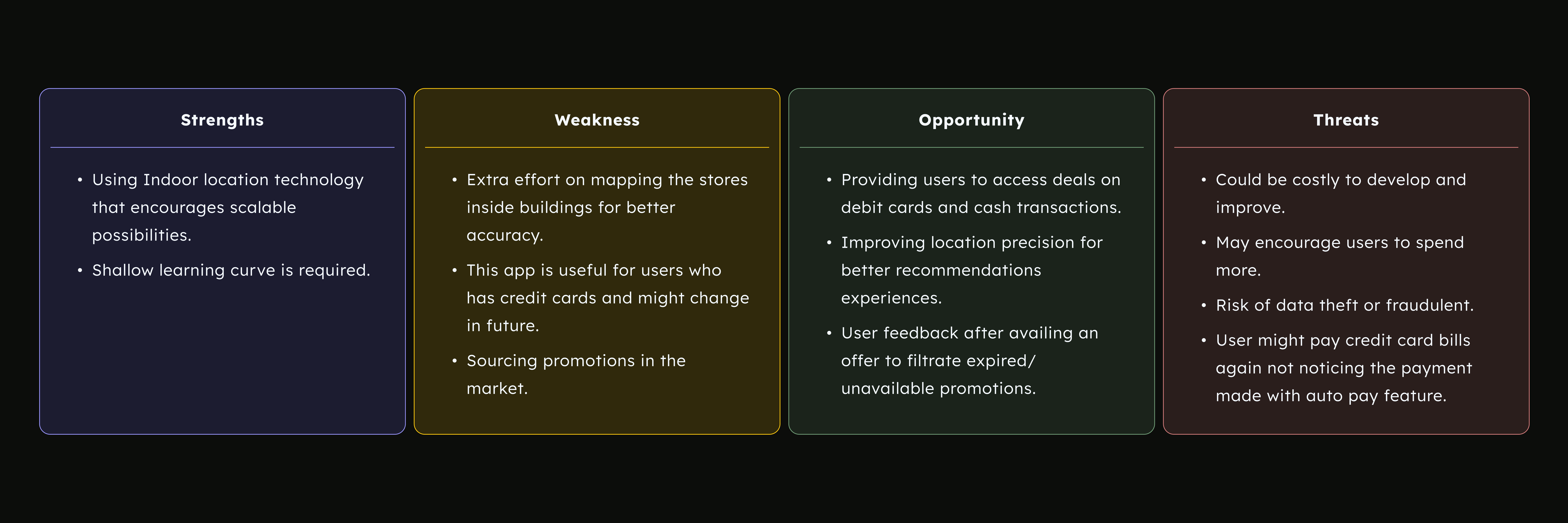
Validating the concept through pressure testing prior to design development
Before committing to the build, we looked at the concept from every side, not just the parts that worked. A SWOT was the simplest way to hold the promise and the risk in one view, which mattered because the core feature was as fragile as it was valuable.
Laying it out this way was a deliberate call. The point was not to sell the idea but to stress test it, and a few of these threats, especially the spending and privacy ones, are exactly what we would want to design guardrails around before this ever reached real users.
12 · MoSCoW Prioritisation
Deciding what ships first, and what never does
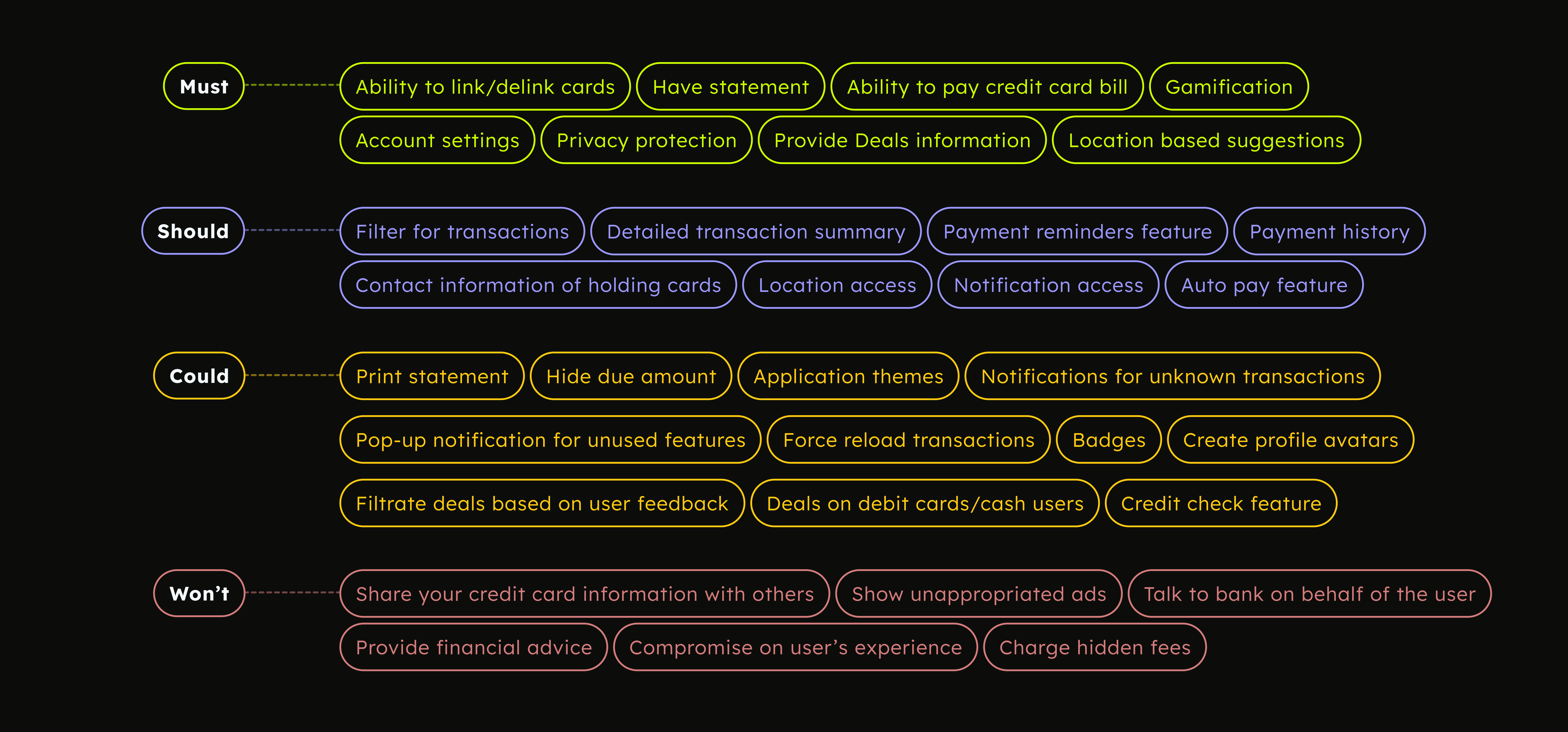
With the ideas piling up, the next call was scope. MoSCoW let us sort every feature by how essential it was, so the first version stayed focused instead of trying to do everything at once.
The Musts cover the core promise, linking cards, paying bills, and location based deals. The Shoulds and Coulds are real but can wait. The Won'ts are the most telling, the lines we chose not to cross, like sharing card data, pushing bad ads, or charging hidden fees. In fintech, being clear about what the product refuses to do is as important as what it builds.
13 · User Flow
Mapping the whole app before drawing a screen
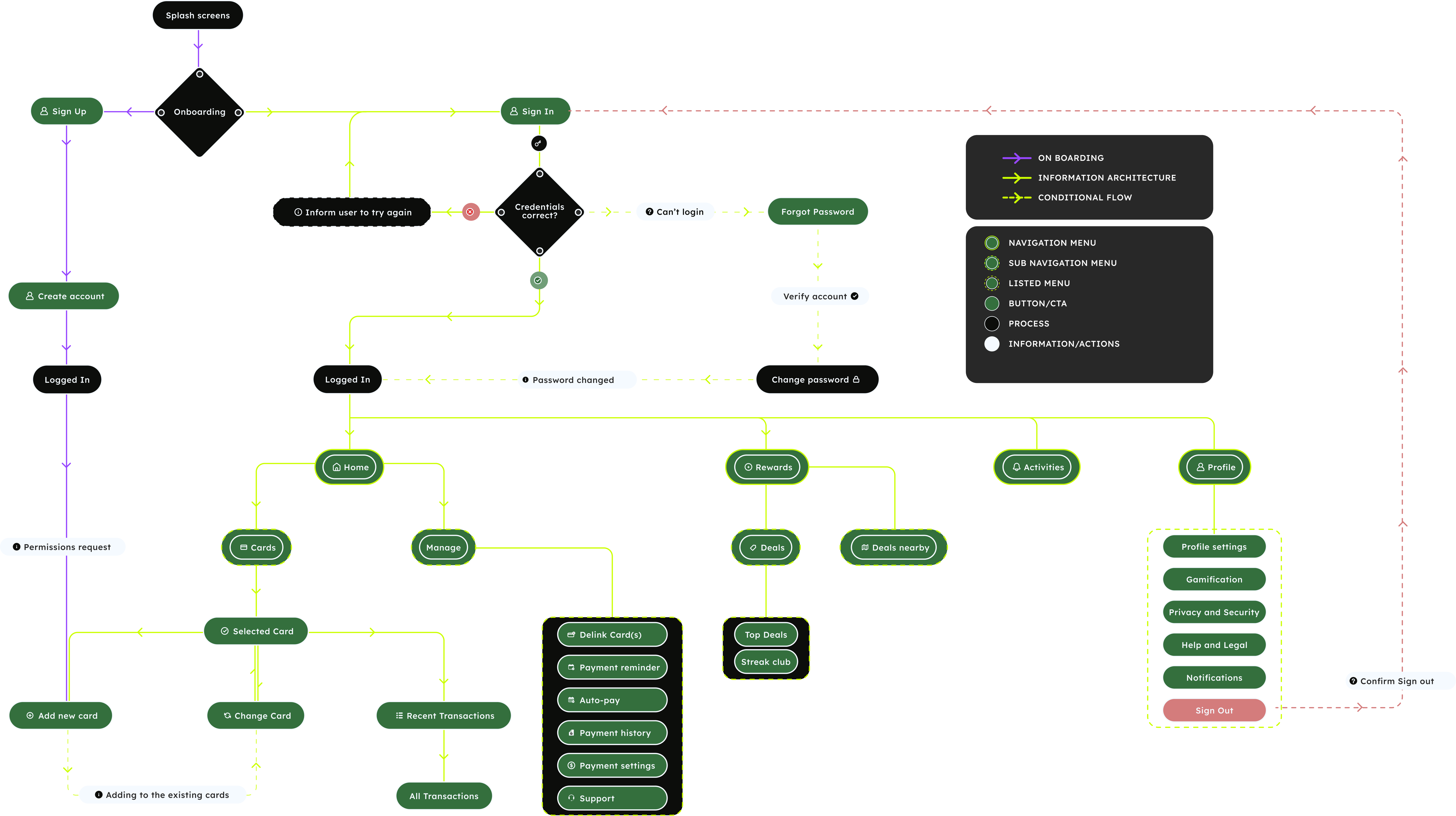
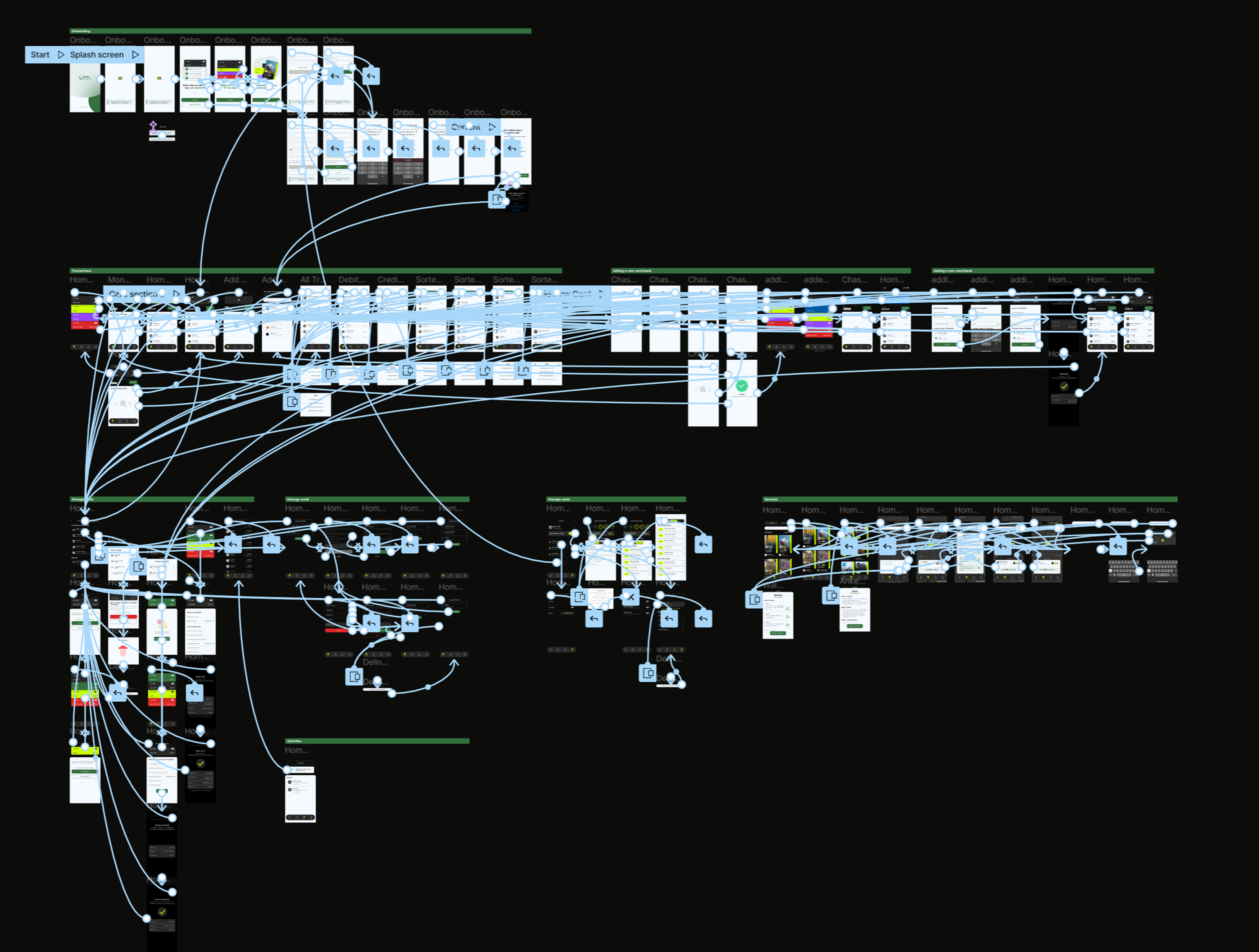
Before any UI, we mapped how someone actually moves through Settle, from the first splash screen to signing out. The flow covers onboarding and sign up, the login checks and their fallbacks like wrong credentials and forgot password, and the four main tabs, Home, Rewards, Activities, and Profile, each with its own sub navigation.
Colour and shape carry meaning here, separating navigation, buttons, processes, and conditional paths, so the logic reads at a glance. Settling the structure this early meant every screen later had a clear home, and nothing got designed that the flow could not actually support.
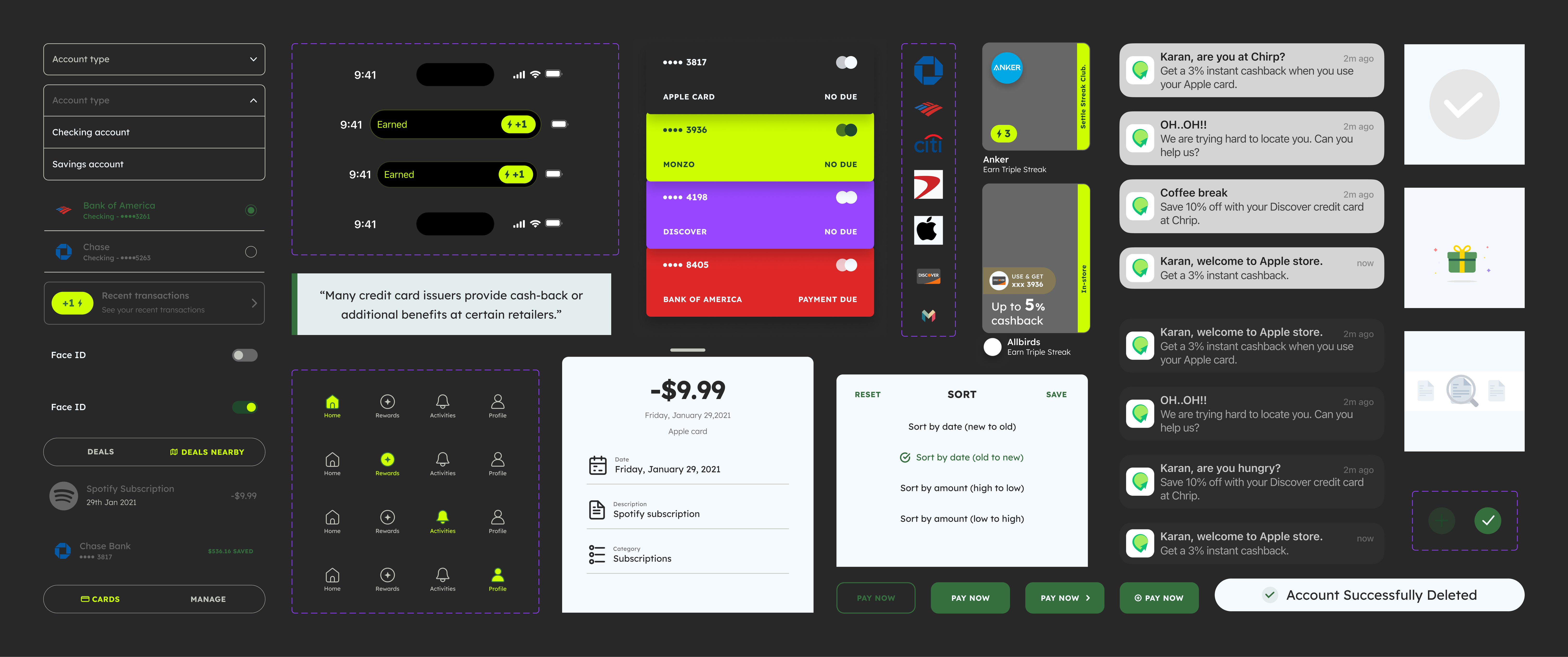
14 · Branding & Design System
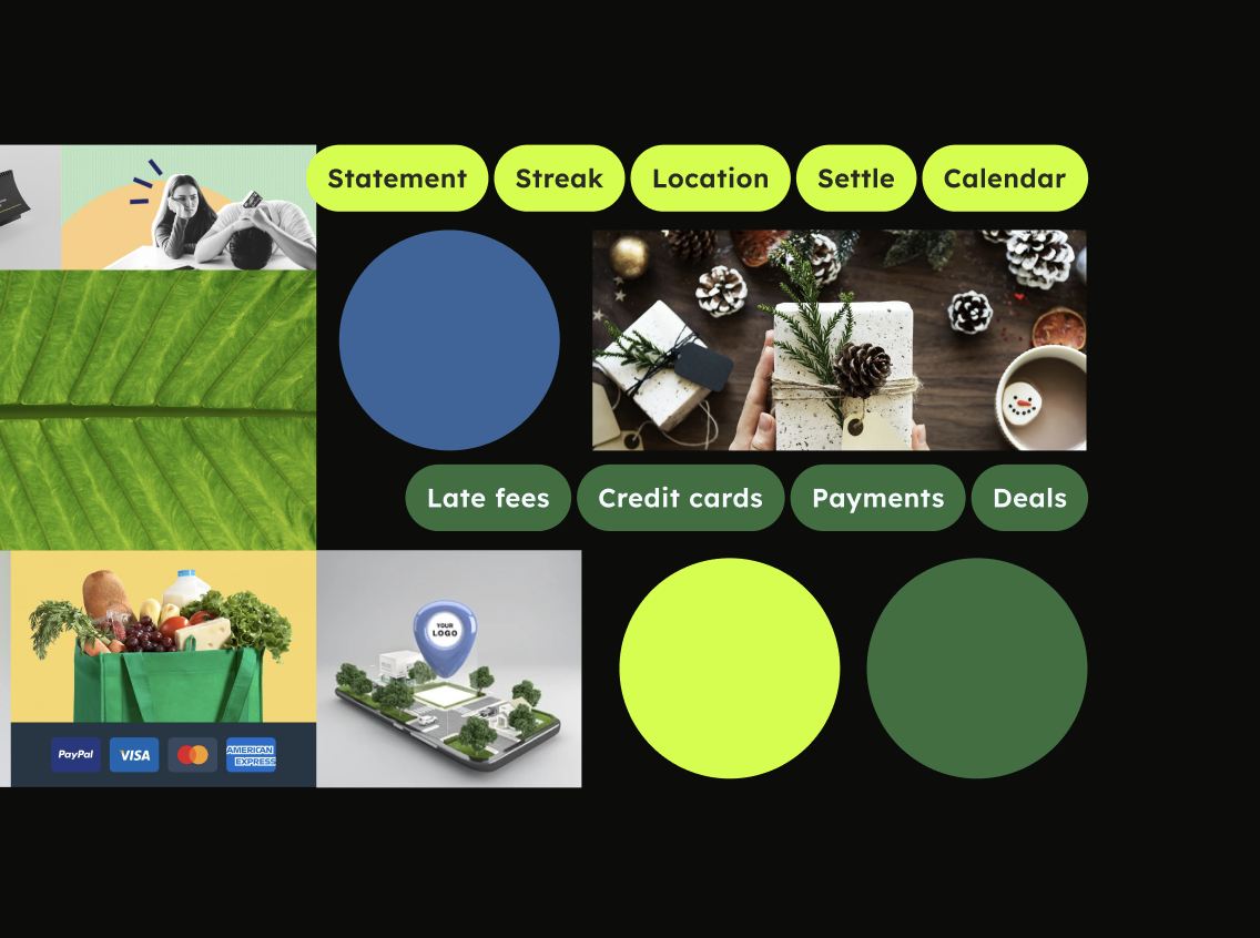
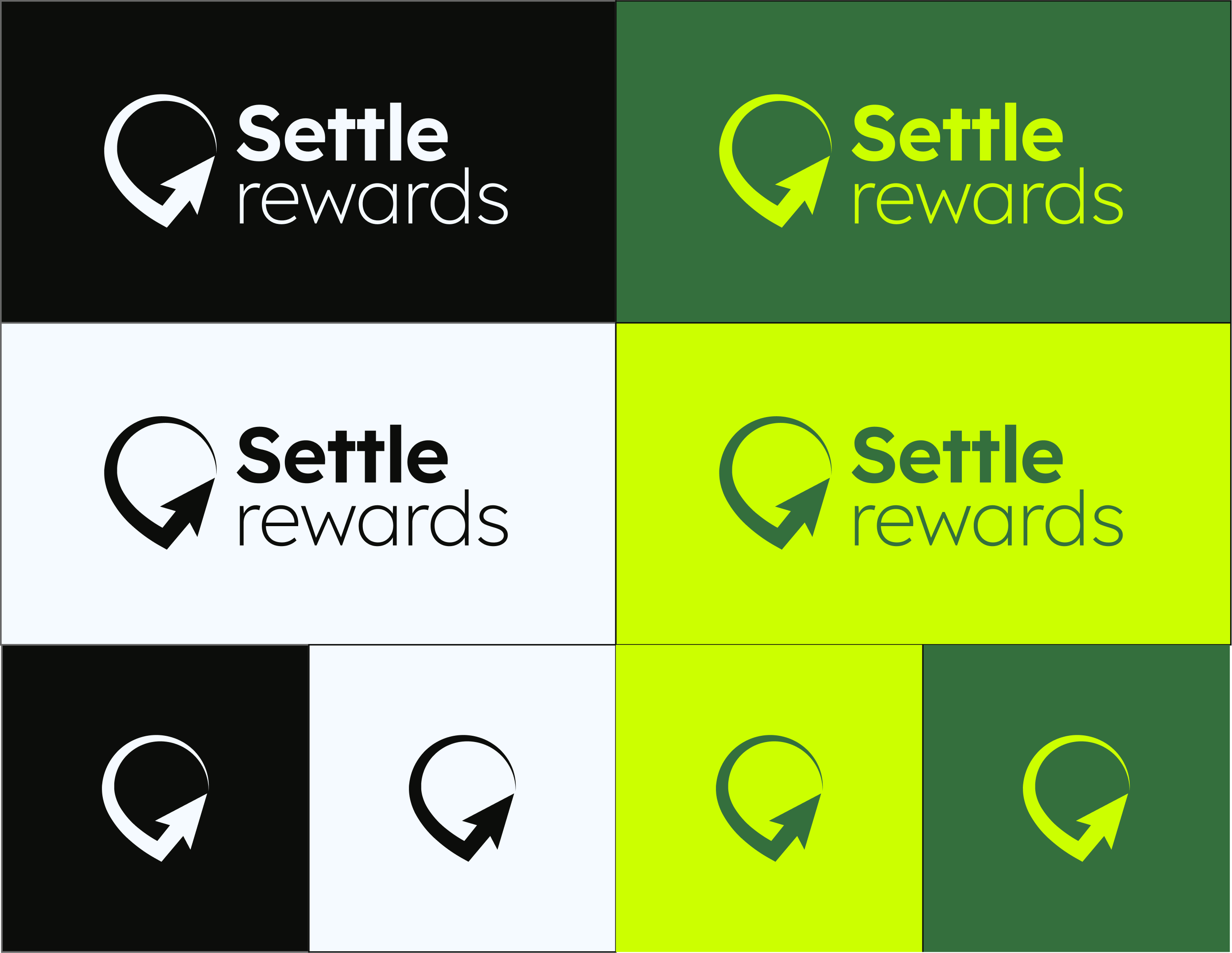
Giving the product a look and a language
Colour and shape carry meaning here, separating navigation, buttons, processes, and conditional paths, so the logic reads at a glance. Settling the structure this early meant every screen later had a clear home, and nothing got designed that the flow could not actually support.
15 · Wireframe to Prototype
From rough screens to a working product
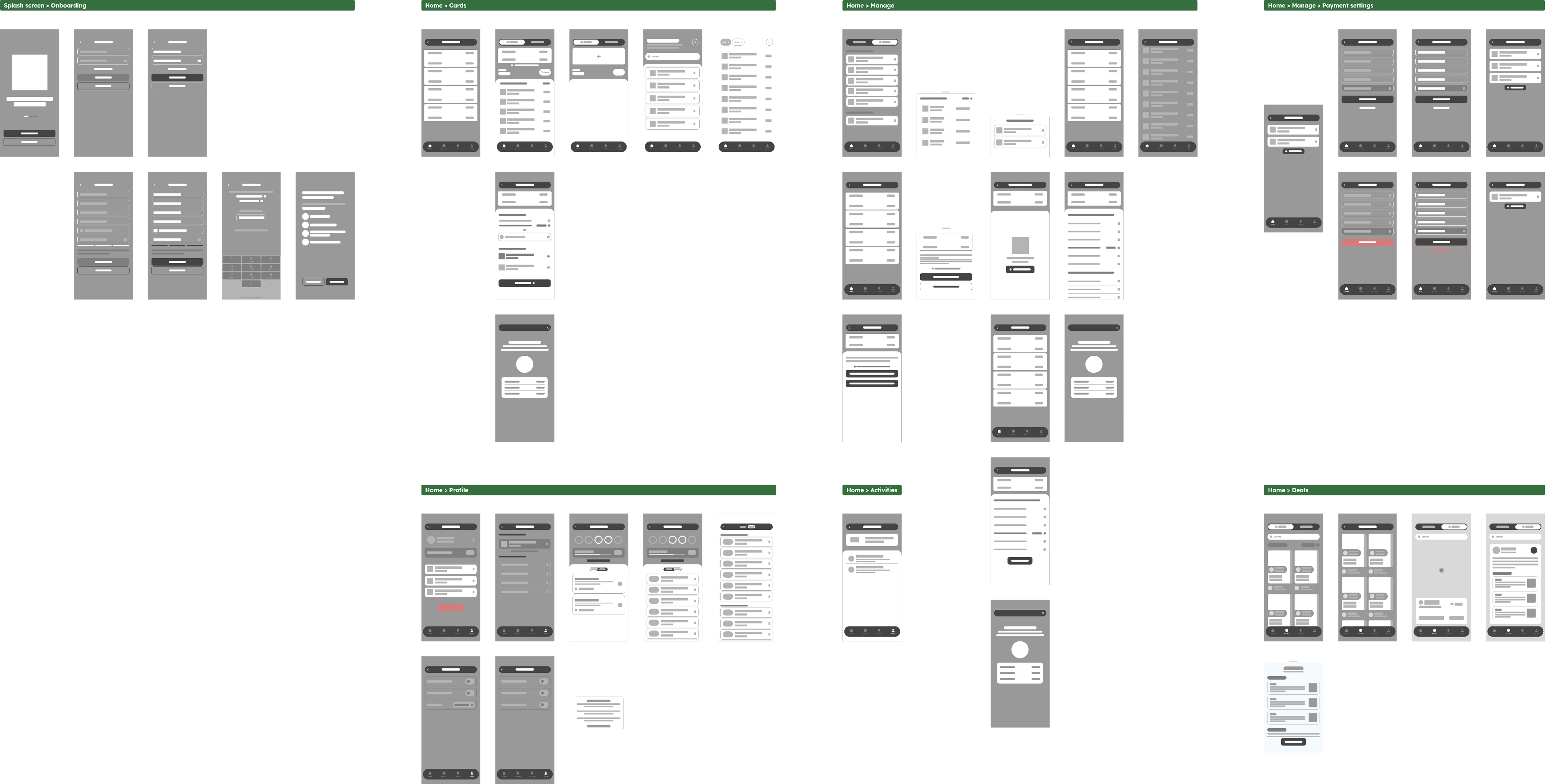
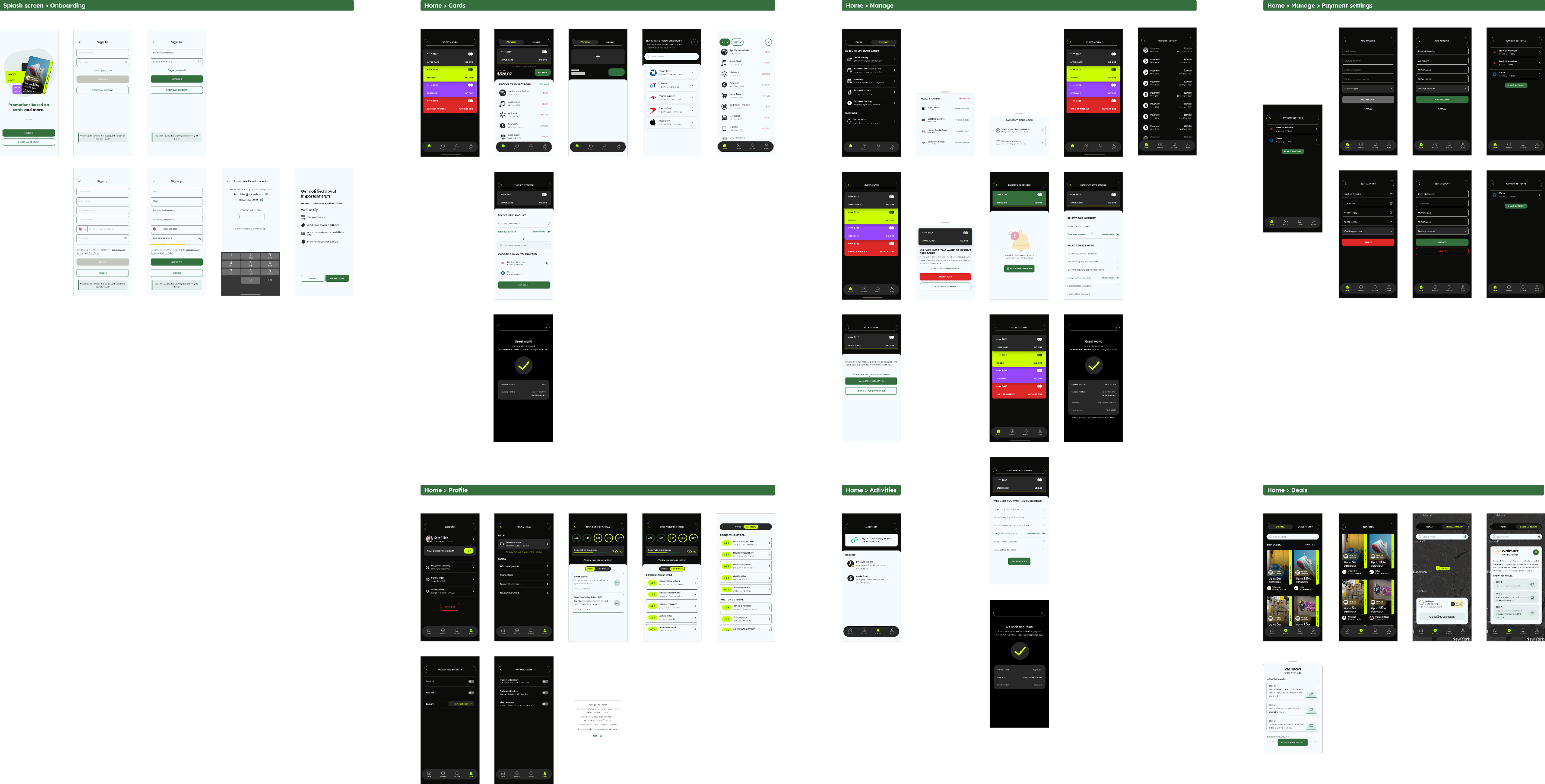
With the structure and style in place, the design moved from idea to something you could actually tap through. It happened in three passes. Wireframes came first, plain grey screens that focused only on layout and flow, making sure every screen from the user flow had a home before any colour or polish went in.
16 · Challenges & Learnings
Final product design and prototyping for the HiFedility
The hardest part was simplifying the experience while the app managed multiple functions card handling, deal display, and notifications within a clean, scalable interface. Designing for diverse users required focusing on core needs, as no single design fit everyone.
This project revealed emerging location technology’s potential for everyday card management. If revisited, we’d prioritize a solution that’s usable, efficient, and scalable from the start a key takeaway for solving real user problems.
17 · Challenges & Learnings
What was hard, and what it taught us
The hardest part was simplifying the experience while the app managed multiple functions card handling, deal display, and notifications within a clean, scalable interface. Designing for diverse users required focusing on core needs, as no single design fit everyone.
The key lesson: user interviews and research kept the product honest and clarified location technology’s value. If revisited, we’d prioritize efficiency and scalability from the start a vital takeaway for solving real user problems.
This project revealed emerging location technology’s potential for everyday card management. If revisited, we’d prioritize a solution that’s usable, efficient, and scalable from the start a key takeaway for solving real user problems.