Industry has changed considerably. Whether it has improved is a difficult question, and no one seems to have settled on an answer.
What is certain is the volume. We have been handed smart tools and agents that absorb large parts of our work, and enough leverage that one contributor can now cover ground that used to need a team. AI moved into the development cycle fast, and it is quietly redrawing what a designer is responsible for.
This is a note from inside that change. Not a forecast. Just what I have watched happen to my own process over the last few months.
When the product prototype arrived early
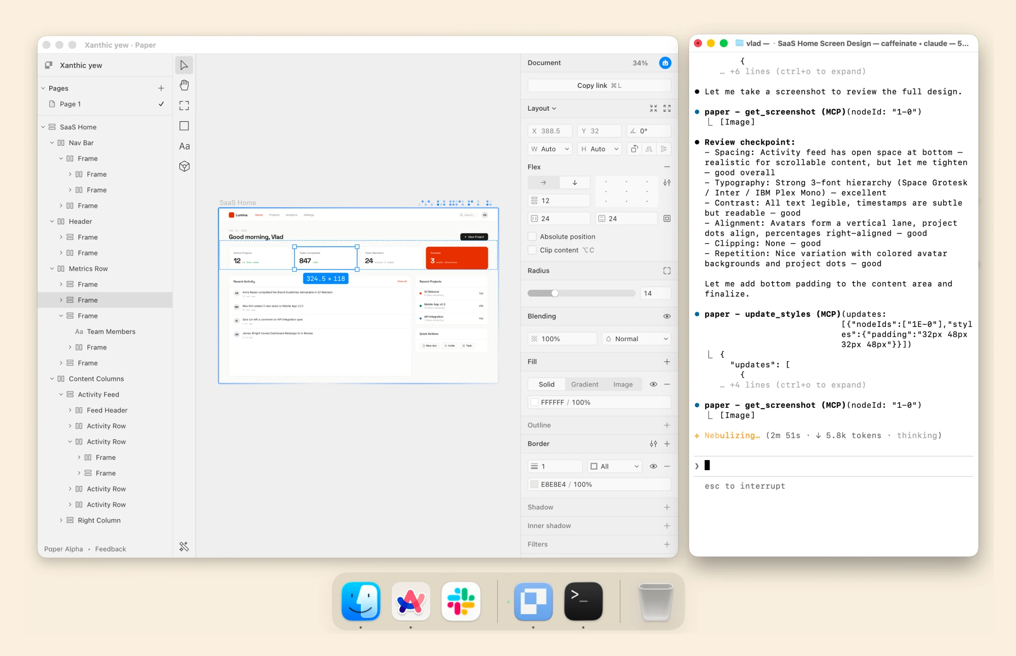
One random day, a PM sent me a working prototype of a feature we hadn’t started yet. We were still in the research phase, working in Figma, and he had built it in an afternoon with an agent.
We were annoyed first. Then curious about why we were annoyed. It was incomplete, obviously. States missing, action points missing, error handling left for another evening. But it answered the question we had blocked out a week to answer.
Our process assumed the answer required a sequence: a flow, some screens, a prototype, a few features, and eventually the thing we were looking for. But he skipped most of the sequence and landed on the answer anyway.
It’s worth examining rather than resenting it.
Before building software used to carry a real setup cost. Someone had to understand the proposal, fit it into the existing system, implement the behaviour, and put it somewhere it could be reviewed.
Now the agents changed the arithmetic completely. For some questions, a small working implementation is cheap enough to use during exploration itself. We build a version, find a bad assumption inside it, and revise our understanding while the design is still soft.
At present, the working prototype serves as a medium for thinking, but there is a complication. A prototype can demonstrate that an interaction works while leaving the reason for building it completely unexamined. Once it exists, it attracts a particular kind of feedback: move this button, shorten that label, add a state. Each of those changes makes the implementation more convincing without making the underlying idea more correct.
The high cost of building previously forced a pause; it was expensive, so we thought carefully first. Now that costs have fallen, our approach must be deliberate rather than forced. We need a clearer account of what each experiment is intended to reveal before we run it.
Mockups are no longer the deliverables, but your judgment matters.
Design job titles such as UX designer, growth designer, design engineer, and product engineers are moving with it. They differ at the edges, but they’re circling the same shift. We are asked for the artifact less and less. More and more, we are asked for the call and for the reasoning underneath it.
One afternoon with three agents
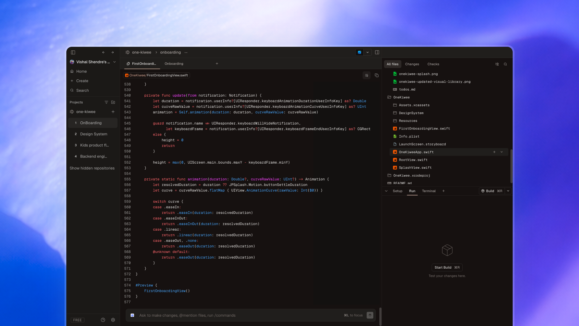
So the next time we had a problem statement, we took it into Conductor before anything else. Not Figma. Not a brainstorm. A problem statement and three agents, running at once.
Not three variations of one idea. Three readings of one sentence. The first took it literally. The second solved the problem sitting next to it. The third misread us in a way that turned out to be more useful than what we had asked for.
20mins later we had three working things instead of three opinions.
That gap is the part I did not expect. In a normal review, three directions means three people defending three positions, and the best-framed one usually wins. Here the artifacts showed up before the arguments did. We were not comparing intentions. We were comparing behaviour - click it, break it, watch what it assumed about the user when nobody was looking.
Two of them we killed in under a minute. That is the number that changed my thinking. Killing a Figma flow takes a meeting, because someone spent two days on it and everyone in the room knows it. Killing an agent's output costs nothing, because nobody paid for it in hours. The sunk cost that used to quietly protect bad work disappeared.
So the skill moved. It is not making the thing. It is knowing which of the three is worth keeping, and being able to say why in one sentence.
What actually got better
For a while I described these tools as replacing steps, which is both wrong and the reason I kept getting defensive about them. They did not replace the steps. They shortened the distance between them.
Design has always been a chain of translations. A thought becomes a sketch, a sketch becomes a screen, a screen becomes a spec, a spec becomes code. Every one of those arrows leaks. Everything I have added to my process this year attacks the arrows, not the boxes.
Pencil, where the intent is set
Paper survived all of it, and it is carrying more weight than before.
It is the only tool in the stack that suggests nothing. Figma offers me the components I already built. An agent offers me something plausible. Paper offers nothing back, which is why the idea is still mine when I leave the page.
And because everything downstream got fast, the slowest step became the one with the most leverage. A weak intent now produces a working, well-built, entirely pointless thing in twenty minutes. The pencil is where that gets caught, and it is the only place it gets caught cheaply. There is more to say about this one, and it is the next section.

That gap is the part I did not expect. In a normal review, three directions means three people defending three positions, and the best-framed one usually wins. Here the artifacts showed up before the arguments did. We were not comparing intentions. We were comparing behaviour - click it, break it, watch what it assumed about the user when nobody was looking.
Two of them we killed in under a minute. That is the number that changed my thinking. Killing a Figma flow takes a meeting, because someone spent two days on it and everyone in the room knows it. Killing an agent's output costs nothing, because nobody paid for it in hours. The sunk cost that used to quietly protect bad work disappeared.
So the skill moved. It is not making the thing. It is knowing which of the three is worth keeping, and being able to say why in one sentence.
When did Pencil come before Figma, and what got better?
Someone asked me this after I walked through the workflow, somewhat suspiciously, as if I were being precious about paper. Fair question. The answer is not romantic.
Figma asks me to decide on things I don’t know yet.
It opens with a frame. A frame has a size, a size implies a device, and a device is a platform decision. That is three commitments before I have drawn anything. Paper has no artboard and no breakpoint.
Then fidelity arrives too early. Auto layout, real type, the actual component out of the library — within ten minutes it looks decided. And a thing that looks decided gets reviewed as decided. I lose the right to be vague, and vagueness is useful. It keeps the question open while it still needs to be open.
Paper is a better brief for an agent than a Figma file is.
This is the part I did not expect, and it is the actual reason for the order.
Hand an agent a Figma frame and it builds the frame. It has been given the answer, so its job collapses to rendering. Hand it a sentence out of my notebook and it builds the idea — and it can land somewhere I would never have drawn.
A Figma file is over-specified input. It narrows the search before the search has run. The three readings I got out of Conductor were only possible because the brief was a sentence and not a screen. Low-fidelity input, high-variance output. At the start, the variance is the whole point.
Paper is a better brief for an agent than a Figma file is.
This is the part I did not expect, and it is the actual reason for the order.
Hand an agent a Figma frame and it builds the frame. It has been given the answer, so its job collapses to rendering. Hand it a sentence out of my notebook and it builds the idea — and it can land somewhere I would never have drawn.
A Figma file is over-specified input. It narrows the search before the search has run. The three readings I got out of Conductor were only possible because the brief was a sentence and not a screen. Low-fidelity input, high-variance output. At the start, the variance is the whole point.
Paper seems the fastest way to be wrong.
The metric that matters at the beginning is not quality. It is the time between having an idea and knowing it is bad. On paper that is about ten seconds. In Figma it is three or four minutes — not long in absolute terms, but long enough that I have made something. And once I have made something, I start defending it.
The honest limit.
Paper is not better than Figma. It does not scale, cannot be shared, cannot be versioned, and stops being useful the moment a third person needs to look at it. Nothing I sketch survives contact with a real team.
That is fine. It is not supposed to. It gets ten minutes, and then it is over.
Figma is where I go once I know what I am making. Paper is how I find out.
Where it still fails
If I stopped here this would be an advertisement, and I have spent enough of this year irritated by those.
Everything an agent makes looks finished.
This is the failure that costs the most, because it is invisible. A junior designer's weak work looks weak you can see the hesitation in it. An agent's weak work is well-formed, correctly spaced, consistently named, and wrong. Fluency is not correctness, but it reads as correctness, and there is no visual tell.
I have had to give up "does it look resolved" as a signal. It served me for years. It is now worth nothing.
They are very good at the middle.
An agent gives you the median answer, the pattern that appeared most often in everything it learned from. That is genuinely useful most days. It is also precisely the thing that makes products indistinguishable from one another.
Nothing in the tooling will ever tell me that my solution is the one four competitors already shipped. The tools optimise toward the average and they are extremely fast, so the risk is not bad design. It is average design, produced at volume, with nothing in the process slow enough to notice. Difference has to be inserted deliberately now. It will not arrive as a by-product of the work.
I skipped research and told myself I had not.
This is the one I am least comfortable writing.
When you can build the answer in twenty minutes, the pull toward asking an agent instead of asking a person is strong, and it does not announce itself as a shortcut. It feels like diligence. There is an artifact at the end of it, and artifacts feel like evidence.
They are not. An agent can tell me what is plausible. It cannot tell me what is true about someone I have not spoken to. A prototype that answers my question is not the same as a user who answers it, and I have caught myself treating the two as interchangeable more than once this year.
And I stopped trusting speed.
Effort used to be a proxy. If something took two weeks, someone had considered it, not necessarily well, but they had been made to sit with it. That proxy is gone. Something arriving in twenty minutes now tells me nothing at all about whether it is right.
They are not. An agent can tell me what is plausible. It cannot tell me what is true about someone I have not spoken to. A prototype that answers my question is not the same as a user who answers it, and I have caught myself treating the two as interchangeable more than once this year.
What the year is actually asking
For most of my career, the majority of my hours went into producing the artifact the pixels, the states, the redlines, the third round of spacing fixes. The thinking happened in the margins. In the gaps, on the train, in the ten minutes before a review.
That is inverted now.
The making is cheap. The thinking is the job.
Which is what we always claimed design was. It simply was not true until the making got cheap.
Whether we are any good at the part that is left is the question this year is actually asking. I do not think we have settled that one either.

.webp)